Tag: UNESCO

  • The Emblem of the Darjeeling Himalayan Railway: Himalayan Landscape as Identity

    Among the many railway company emblems created during the British period in India, the original emblem of the Darjeeling Himalayan Railway Company (DHR) is perhaps the most unconventional. Unlike almost every contemporary railway company that celebrated locomotives, engineering works, bridges or industrial progress, the Darjeeling Himalayan Railway chose to identify itself almost entirely with the Himalayan landscape.

    At first glance, the emblem appears surprisingly simple. A vast range of snow-covered mountains dominates the design, while there is no locomotive, no railway track, no wheel, no bridge and no industrial motif anywhere in the composition. For a railway company, this seems almost paradoxical.

    Yet this apparent simplicity reveals a remarkably sophisticated understanding of what the company was actually selling.

    A Railway Company Selling a Destination

    The Darjeeling Himalayan Railway Company was incorporated not to build another commercial trunk railway but to connect the tea plantations and hill station of Darjeeling with the plains of Bengal. Franklin Prestage and Gillanders, Arbuthnot & Co. recognised that the railway’s greatest commercial asset was not merely transportation—it was access to one of the most spectacular mountain landscapes in the British Empire.

    Consequently, the company’s emblem did not advertise its engineering. It advertised its destination.

    Long before the age of tourism branding, the company understood that passengers were travelling to the Himalayas, not simply by railway.

    Darjeeling Himalayan Railway Emblem

    The Himalayas as the Company’s Identity

    The most striking feature of the emblem is the overwhelming dominance of the Himalayan peaks. Nearly the entire field is devoted to mountains, leaving very little space for decorative elements. This was almost certainly deliberate.

    For European travellers of the late nineteenth century, the Himalayas represented mystery, grandeur and adventure. For British officials escaping the summer heat of Calcutta, Darjeeling symbolised health, prestige and imperial leisure. Tea planters viewed it as the economic heart of their industry.

    Thus the mountains alone conveyed everything the company wished to communicate. The emblem therefore became an advertisement for the landscape itself.

    No Railway Symbol in the Logo

    To modern observers, the absence of railway imagery may appear unusual. However, when interpreted in its historical context, the omission becomes logical.

    The Darjeeling Himalayan Railway Company did not need to convince people that it possessed locomotives or tracks. Every railway company had those. What distinguished the DHR from hundreds of other railway companies across the world was something no competitor could replicate—the unique Himalayan environment through which it passed. Rather than depicting its trains, the company chose to depict what made its trains special. This transformed the emblem from an engineering symbol into a geographical one.

    An Early Example of Destination Branding

    Modern tourism organisations routinely use mountains, beaches or monuments as their visual identities. The DHR Company adopted exactly this approach more than a century earlier. Its emblem can therefore be regarded as one of India’s earliest examples of destination branding, where the product being promoted was not the transport system but the experience that awaited the traveller.

    In effect, the railway company marketed scenery instead of machinery.

    The Meaning of Simplicity

    Unlike the ornate heraldic emblems of many princely state railways, the Darjeeling Himalayan Railway Company’s seal is remarkably restrained. There are no crowns, shields, supporters or elaborate Victorian flourishes. This simplicity was not a lack of imagination but a statement of confidence. The mountains alone were considered sufficient to identify the company.

    Few railway companies anywhere in the world possessed a landscape so iconic that it could serve as their sole visual identity.

    Philosophy Behind the Design

    The emblem subtly communicates an important philosophy.

    “The railway does not dominate nature. Instead, it exists because of nature.”

    This distinction perfectly reflects the engineering philosophy of the Darjeeling Himalayan Railway itself. The line does not attempt to conquer the mountains through massive tunnels or monumental viaducts. Instead, it adapts to the terrain by means of loops, reverses and gentle curves, allowing the railway to coexist with the landscape rather than overwhelm it.

    The emblem mirrors this philosophy by allowing the Himalayas—not the railway—to occupy centre stage.

    A Remarkably Modern Visual Identity

    Although designed during the Victorian period, the emblem feels surprisingly contemporary. Its reliance on negative space, limited symbolism and a single dominant visual element is closer to modern corporate logo design than to nineteenth-century heraldry.

    Today, many successful brands employ minimalist designs to create instant recognition. The Darjeeling Himalayan Railway Company achieved the same effect more than a century ago. Its emblem demonstrates that powerful branding often depends on selecting one unforgettable symbol rather than assembling many.

    A Symbol That Endured Beyond the Company

    The original company ceased to exist long ago, but its emblem survived. It continued to be associated with the Darjeeling Himalayan Railway through successive administrations and, after the railway gained UNESCO World Heritage status in 1999, became one of the historic identities preserved by Indian Railways. In 2021, Indian Railways undertook the formal registration of the century-old DHR logos to protect them as intellectual property.

    Its continued use illustrates how successful the original design was. More than a century after its creation, the mountains remain instantly recognisable as the visual identity of the Darjeeling Himalayan Railway.

    The original emblem of the Darjeeling Himalayan Railway Company is unlike any other railway company logo in India. It does not celebrate locomotives, tracks or engineering feats. Instead, it celebrates the very reason the railway was built—the Himalayas.

    In doing so, the company revealed an extraordinary understanding of its own identity. It recognised that passengers would remember not the machinery that carried them, but the mountains that awaited them. The emblem therefore transformed a railway company into the visual ambassador of an entire landscape, making it one of the earliest and most sophisticated examples of corporate destination branding in the history of Indian railways.

    References

  • Jaipur State Railway Emblem – When the Railway Became the Identity

    Jaipur State Railway Emblem – When the Railway Became the Identity

    Among the many railway emblems adopted by the princely states of India, the Jaipur State Railway emblem stands apart for what it deliberately chooses not to depict. Unlike the elaborate heraldic devices of states such as Jodhpur, Morvi or Jamnagar & Dwarka—which prominently showcased royal crowns, coats of arms, mythical animals or dynastic symbols—the Jaipur State Railway emblem is remarkably restrained. At its heart is not a king, a crest or a palace, but a steam locomotive.

    This design philosophy reflects the character of the Jaipur State Railway itself. Established by the Jaipur Durbar, the railway was conceived primarily as an instrument of administration, commerce and public utility rather than as a vehicle for projecting royal grandeur. Beginning with the Jaipur–Sawai Madhopur line in 1905 and later extending into the Shekhawati region, the network connected the capital with important commercial centres and the Bombay, Baroda & Central India Railway (BB&CI), significantly improving the state’s economic integration.

    A Locomotive at the Centre

    The most striking feature of the emblem is the steam locomotive placed prominently in the centre. Unlike many contemporary railway insignia where locomotives appeared only as decorative motifs, here the engine becomes the principal symbol. It immediately communicates the purpose of the organisation without requiring elaborate heraldic interpretation.

    The locomotive represents far more than a machine. At the beginning of the twentieth century, it embodied:

    • industrial progress,
    • engineering excellence,
    • economic development,
    • and the promise of modern transportation.

    For Jaipur State, the railway itself had become the most visible symbol of progress, and the emblem celebrates that achievement.

    Jaipur State Railway Logo
    Emblem of Jaipur State Railway

    Simplicity with Purpose

    A careful examination of the emblem reveals that it contains very little overt princely symbolism. There are no elaborate royal supporters, no complex shield carrying the full arms of the Kachwaha rulers, and no attempt to reproduce the grandeur of Jaipur’s royal court.

    Instead, the design is clean, balanced and functional. The decorative elements surrounding the locomotive serve primarily as framing devices rather than royal insignia. This simplicity gives the emblem an almost corporate appearance—quite advanced for its period—and suggests that the Jaipur administration wanted the railway to be recognised first as a professional transport organisation rather than merely an extension of the royal household.

    This restrained approach distinguishes Jaipur State Railway from many other princely railways, whose logos often mirrored their state’s coat of arms.

    Reflecting a Modern Administration

    The choice of such a practical emblem mirrors Jaipur State’s broader administrative outlook during the early twentieth century. The Jaipur Durbar invested heavily in infrastructure and recognised that railways were essential for trade, movement of goods, and efficient governance.

    By placing the locomotive at the centre, the emblem conveys a simple yet powerful message: The railway itself was the state’s greatest symbol of modernity. Rather than celebrating dynastic authority, the logo celebrates engineering achievement and public service.

    An Emblem of Function Rather than Power

    The Jaipur State Railway emblem therefore represents a subtle shift in visual identity. It marks a transition from traditional royal heraldry towards institutional branding. The locomotive is not merely decorative—it is the emblem’s identity. Every element of the design directs the viewer’s attention towards the engine, reinforcing the idea that the railway was the state’s pride and its gateway to economic growth. The absence of excessive royal symbolism makes the logo timeless, allowing it to represent not just the Jaipur Durbar but the railway organisation itself.

    Legacy

    Following Independence, the Jaipur State Railway became part of the integrated Indian Railways system. Although the organisation disappeared as an independent entity, its emblem survives as one of the officially recognised Indian Railways Heritage Logos, preserving the visual identity of a railway that chose progress over pomp.

    Today, the Jaipur State Railway emblem remains an excellent example of how a logo can communicate institutional values through simplicity. In an era when many princely railways relied on crowns, shields and heraldic animals to proclaim authority, Jaipur placed a steam locomotive at its centre—declaring that the railway itself was the state’s greatest achievement.

  • The Emblem of the Junagadh State Railway – A Symbol of Power, Prosperity and Maritime Heritage

    The Emblem of the Junagadh State Railway – A Symbol of Power, Prosperity and Maritime Heritage

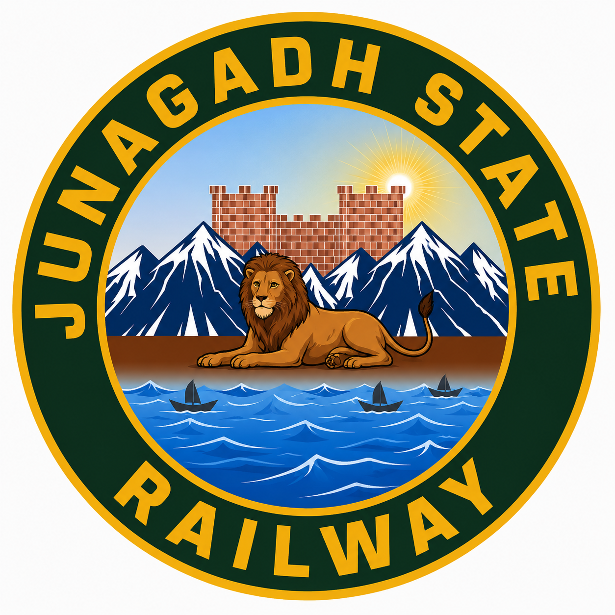
    Among the many princely state railway emblems of pre-Independence India, the emblem of the Junagadh State Railway is perhaps one of the most distinctive. Unlike many railway insignia that prominently feature locomotives or heraldic crests, the Junagadh emblem tells the story of the state itself. Every element—the lion, the fort, the mountains, the sea and the tiny sailing boats—was carefully chosen to represent the geographical, political and economic identity of the princely state. Rather than glorifying the railway alone, the emblem presents the railway as a lifeline connecting the state’s natural wealth, maritime trade and royal authority.

    The Origins of the Junagadh State Railway

    The Junagadh State Railway was established by the Nawabs of Junagadh during the late nineteenth century as part of the rapid expansion of railways across Kathiawar (Saurashtra). The first sections opened in the 1880s and gradually linked Junagadh with Veraval, Jetalsar and neighbouring princely states. These connections integrated the state into the wider railway network of western India, facilitating passenger movement, trade and pilgrimage while strengthening Junagadh’s economy.

    Unlike the larger railway companies operated directly by the British Government, the Junagadh State Railway remained a symbol of the Nawab’s administration and reflected the state’s independent identity within British India.

    The Emblem

    Junagadh State Railway Emblem
    Emblem of Junagarh State Railway

    At first glance, the emblem appears simple, but every component carries symbolic significance.

    The outer circular band, finished in deep green with golden lettering proclaiming “JUNAGADH STATE RAILWAY,” represents continuity, unity and permanence. The circular form was a popular design among princely state railway logos because it conveyed authority while providing an instantly recognisable corporate identity.

    At the centre of the emblem lies a majestic lion resting calmly upon a strip of land. This is undoubtedly the most important feature of the logo. Junagadh was—and continues to be—the home of the Asiatic Lion, whose last natural habitat survives in the Gir forests. The lion symbolises courage, sovereignty and the unique natural heritage of the state. Rather than depicting the animal in an aggressive posture, the artist portrays it in repose, conveying confidence and regal authority rather than conquest.

    Behind the lion rises a fortified structure, representing the historic Uparkot Fort, one of India’s oldest surviving fortifications and a defining landmark of Junagadh. The fort signifies the antiquity, resilience and military strength of the princely state.

    Flanking the fort are towering snow-clad mountains. Although Junagadh itself does not possess Himalayan peaks, these stylised mountains are likely intended to represent the rugged Girnar Hills, one of western India’s most sacred mountain ranges. The artist appears to have used dramatic alpine forms to emphasise grandeur and permanence rather than geographical accuracy.

    A radiant sun rising behind the fort symbolises hope, prosperity and enlightenment. Across Indian heraldic traditions, the rising sun represents progress and the dawn of a new era—an appropriate message for a railway that was transforming transportation and commerce.

    The Sea and Three Boats

    Perhaps the most intriguing aspect of the emblem is the depiction of the blue sea in the foreground, upon which three small sailing boats can be seen.

    These boats are not decorative additions. They are a direct reference to Junagadh’s long maritime tradition. The state controlled important ports such as Veraval, one of western India’s oldest fishing and trading harbours. For centuries, merchants from this coast traded with Arabia, East Africa and the Persian Gulf.

    The inclusion of three boats symbolises maritime commerce, prosperity and Junagadh’s historic connection with the Arabian Sea. Their presence also reminds the viewer that the railway was not an isolated transport system—it was designed to connect inland markets with coastal ports, enabling goods and passengers to move efficiently between sea and rail.

    In this sense, the boats complete the story told by the emblem: the railway united forests, hills, forts and ports into a single economic network.

    Why the Emblem is Unique

    Most princely railway emblems either displayed royal coats of arms or locomotives. The Junagadh State Railway emblem is unusual because it contains neither. Instead, it presents a visual narrative of the state itself.

    The lion represents wildlife and sovereignty.

    The fort represents history and political authority.

    The Girnar hills symbolise geography and spirituality.

    The sea and boats celebrate maritime trade.

    Together these elements communicate the identity of Junagadh more effectively than any locomotive could.

    A Lasting Legacy

    Following Independence, the Junagadh State Railway was merged into the railway systems of Saurashtra and eventually became part of Western Railway under Indian Railways. While the railway itself disappeared as an independent entity, its emblem remains an important reminder of how princely states expressed their identity through railway symbolism.

    Today, the Junagadh State Railway emblem stands as more than a railway logo. It is a miniature portrait of an entire kingdom—celebrating its wildlife, historic fortifications, sacred landscape and maritime traditions. It reflects an era when railways were not merely transport networks but proud ambassadors of the states they served, carrying their heritage as prominently as their passengers and freight.