Category: Railway Emblems

  • Jai Jangaldhar Badshah: From the Desert Kingdom of Bikaner to the Emblem of a State Railway

    Some railway emblems simply identify a company. Others carry an entire political and cultural history inside them. The emblem of the Bikaner State Railway belongs firmly to the second category.

    At first glance it looks like elaborate princely heraldry: falcons, a tree, animal supporters, and a scroll reading “Jai Jangaldhar Badshah.” But behind those symbols lies a story that begins centuries before the first railway ever reached Bikaner — a story of an arid landscape, pastoral communities, Rathore state formation, dynastic memory, British-era heraldry, and finally the transformation of a desert kingdom by rail.

    The Land Before the Railway

    To understand the emblem, begin with Jangladesh — the arid territory that later became Bikaner State, where the availability of water governed settlement, agriculture, grazing, and movement.

    This was not empty wilderness. Long before any railway existed, Jangladesh was home to organised Jat communities — the Godaras, Sarans, Punias, Beniwals, Sihags, and others — who held substantial local authority over settlements, wells, and grazing lands. Bikaner State was built within an already-occupied and politically organised landscape, not upon a blank one.

    In a land without dependable rivers, water and pasture were the fundamental political resources, and a ruler’s power was inseparable from his ability to secure both. It was into this world that Rao Bika, son of Rao Jodha of Marwar, arrived in the late fifteenth century — founding a Rathore political centre that emerged through interaction, conflict, and accommodation with the communities already rooted there, not by imposition on an empty canvas.

    From Jangladesh to Bikaner

    Over succeeding generations, the Rathore rulers became identified with the territory itself, and the geographical name Jangladesh acquired dynastic weight. This produced one of the most distinctive titles associated with the Bikaner house: Jangaldhar Badshah — broadly, “King of Jangladesh.”

    Tradition associates the title with Karan Singh of Bikaner, who ruled in the seventeenth century, tying it to his celebrated confrontation with the Mughal emperor Aurangzeb. The precise details of that episode belong to dynastic memory rather than verified record, but Karan Singh’s conflict with Aurangzeb is historically attested, and the phrase itself endured well beyond his reign — Maharaja Ganga Singh referred to it in a public speech in 1913 as the motto of the Bikaner coat of arms.

    The words on the railway emblem, in other words, were not coined for the railway. They were already centuries old when the railway inherited them.

    The British Give an Old Identity a New Visual Language

    The next stage came in the nineteenth century, as the British Raj extended European heraldic conventions to India’s princely states. At the 1877 Imperial Assemblage in Delhi, Bikaner received a formal coat of arms in the European heraldic manner, under Maharaja Dungar Singh (r. 1872–1887).

    That achievement combined:

    • a shield of horizontal red-and-gold bars
    • three falcons, originally paired with trident devices
    • a tree as the crest, set above a helmet in standard heraldic form
    • two large-cat supporters flanking the shield
    • the dynastic motto, Jangaldhar Badshah

    The result was a hybrid: European in grammar, unmistakably Bikaneri in content. The British supplied the heraldic framework — shield, crest, supporters, motto — but the symbols and legend were drawn from Bikaner’s own history. This was neither an imported design nor an unaltered medieval emblem, but a nineteenth-century visual reinterpretation of an older identity.

    Ganga Singh and the Modern Bikaner Identity

    When Maharaja Ganga Singh succeeded to the throne in 1887, Bikaner entered a new phase of railways, irrigation, education, and administrative reform. The arms evolved alongside the state: later representations from his reign drop the tridents seen in the Dungar Singh version, while retaining the three falcons, tree crest, cat supporters, and motto. By this period, the arms had become more than ceremonial heraldry — they were becoming the visual identity of a modernising state.

    It was precisely during this period that the railway transformed Bikaner.

    The Railway Enters Jangladesh

    Bikaner’s first rail connection opened in 1891, as part of the Jodhpur State Railway system, which subsequently expanded into the joint Jodhpur–Bikaner Railway. In 1924, that joint system was divided along state lines, giving Bikaner its own distinct Bikaner State Railway.

    The railway was revolutionary for the state: it connected a remote desert capital to India’s wider rail network, opened new markets, and helped integrate settlements once separated by enormous distances and difficult terrain. By the 1930s its network had grown substantially, eventually reaching roughly 883 miles of metre-gauge track by 1943 — one of the principal instruments through which Bikaner was being drawn into the modern economy.

    When the Royal Emblem Became a Railway Emblem

    Bikaner State Railway Emblem
    Emblem of the Bikaner State Railway, incorporating the historic Bikaner arms and the dynastic motto “Jai Jangaldhar Badshah” — a visual link between the Rathore kingdom of Jangladesh and the modern railway state.
    Image courtesy of the Manager/Curator, Lucknow Locomotive Museum, 2020; via FIBIwiki.

    It was in this environment that Bikaner’s dynastic identity entered railway heraldry. A surviving wooden shield in the National Railway Museum, York, is catalogued by the Science Museum Group simply as a “small wooden shield, with painted armorial device of the Bikaner State Railway,” part of the museum’s wider collection of princely-state railway heraldry.

    This is perhaps the clearest evidence of what the emblem meant: the railway did not merely operate under the authority of the Bikaner state — it visually represented it.

    The Emblem We See Today

    The clearest surviving digital record of the design is preserved by FIBIwiki as Bikaner State Railway Logo b.jpg, supplied by the Manager/Curator of the Lucknow Locomotive Museum in 2020. At its centre stand the three falcons against the striped shield; above rises the tree; on either side stand the animal supporters; and beneath it all runs the ribbon:

    जय जंगल धर बादशाह Jai Jangaldhar Badshah

    The railway, in effect, carried a message far older than itself: this is the railway of the King of Jangladesh.

    Reading the Symbols with Care

    It’s tempting to assign a precise meaning to every element, but the surviving sources don’t fully support that. A few things are worth noting cautiously:

    • The falcons are the shield’s most recognisable feature, carried over intact into the railway-associated form.
    • The tree, crowning the arms of a desert kingdom, is a striking image — a reminder that Jangladesh was never a featureless waste, but a landscape of hardy vegetation, grazing, and wells. Its exact species and symbolism, however, are not documented, and it would be a mistake to identify it (for instance, as the khejri) without evidence.
    • The animal supporters are described variously as leopards or tigers across different sources. Rather than force a single identification, it’s more accurate to call them simply the large-cat supporters — a reminder that princely heraldry was often reproduced in slightly varying forms rather than fixed to one rigid blazon.

    More Than a Logo: An Instrument of State

    The Bikaner State Railway did more than move passengers between stations — it became an instrument of economic and geographic transformation. As irrigation works like the Gang Canal opened new agricultural land, the railway carried the materials, produce, and people that made that transformation possible.

    In this light, the old title Jangaldhar Badshah took on an almost paradoxical modern meaning: a title born of desert geography now presided over a state actively re-engineering that same geography.

    A Medieval Title on a Modern Railway

    The phrase Jangaldhar Badshah belonged originally to a world of forts, cavalry, pastoral clans, wells, and frontier struggle. By the twentieth century, the same words rode on the emblem of an institution built on steam locomotives, metre-gauge engineering, telegraph lines, and long-distance commerce. The emblem connected two very different Bikaners — the Rathore frontier kingdom, and the modern railway state — and did so not as ownership, but as continuity: the railway crossed the same territory whose geography had once defined the ruler’s authority, and became one of the chief instruments through which that territory was now administered and transformed.

    From Bikaner State Railway to Railway Heritage

    The Bikaner State Railway’s independent existence ended with the post-Independence reorganisation of Indian Railways; its surviving Indian territory was absorbed into the reorganised system in 1952. But the emblem survived in museums and heritage collections, and Indian Railways has since formally recognised it: a 2021 Railway Board document listed “Bikaner State” among its historic railway heritage identities.

    The heraldry has, in effect, lived three lives — first as dynastic identity, then as railway identity, and now as railway heritage.


    Research note: The National Railway Museum’s surviving shield is identified as the Bikaner State Railway armorial device, but its manufacturing date is not recorded in the museum’s catalogue. The digital emblem used for comparison here was supplied by the Manager/Curator of the Lucknow Locomotive Museum via FIBIwiki. This article does not assign an unsupported date to the surviving physical shield, nor claim that every Bikaner State Railway vehicle carried an identical version of the device — Bikaner’s heraldry, like much princely-state heraldry, existed in several related forms.

    References

    1. National Railway Museum / Science Museum GroupBikaner State Railway armorial device, Railway Heraldry collection.
      Science Museum Group Collection – Bikaner State Railway armorial device
    2. FIBIwiki (FIBIS)Bikaner State Railway. Historical details of the railway’s formation in 1924, route development and subsequent history.
      FIBIwiki – Bikaner State Railway
    3. FIBIwiki (FIBIS)Jodhpur-Bikaner Railway. History of the joint Jodhpur-Bikaner system before its division in 1924.
      FIBIwiki – Jodhpur-Bikaner Railway
    4. North Western Railway, Indian RailwaysOverview of Bikaner Division. Historical account of the first railway link to Bikaner in 1891 and the formation of Bikaner State Railway in 1924.
      North Western Railway – Overview of Bikaner Division
    5. Indian Railways Fan Club (IRFCA)The Palace on Wheels. Information on the surviving royal saloons of the former princely-state railways, including Bikaner State Railway vehicles and railway coats of arms.
      IRFCA – The Palace on Wheels
    6. Hubert de VriesBharat / Rajasthan: Bikaner. Detailed heraldic research on the evolution of the Bikaner State arms and their various forms.
      Hubert de Vries – Bikaner Heraldry
    7. David F. PhillipsEmblems of the Indian States. Study of the development and variations of princely-state heraldry in British India, including Bikaner.
    8. Railway Department, Government of IndiaAdministration Report on Railways in India, particularly the 1918 report, for contemporary route mileage and the organisation of the Jodhpur-Bikaner Railway.
    9. Government of India, Railway DepartmentHistory of Indian Railways, Constructed and in Progress, 31 March 1937. Contemporary information on the development of the Bikaner State Railway.
  • The Emblem of the Darjeeling Himalayan Railway: Himalayan Landscape as Identity

    Among the many railway company emblems created during the British period in India, the original emblem of the Darjeeling Himalayan Railway Company (DHR) is perhaps the most unconventional. Unlike almost every contemporary railway company that celebrated locomotives, engineering works, bridges or industrial progress, the Darjeeling Himalayan Railway chose to identify itself almost entirely with the Himalayan landscape.

    At first glance, the emblem appears surprisingly simple. A vast range of snow-covered mountains dominates the design, while there is no locomotive, no railway track, no wheel, no bridge and no industrial motif anywhere in the composition. For a railway company, this seems almost paradoxical.

    Yet this apparent simplicity reveals a remarkably sophisticated understanding of what the company was actually selling.

    A Railway Company Selling a Destination

    The Darjeeling Himalayan Railway Company was incorporated not to build another commercial trunk railway but to connect the tea plantations and hill station of Darjeeling with the plains of Bengal. Franklin Prestage and Gillanders, Arbuthnot & Co. recognised that the railway’s greatest commercial asset was not merely transportation—it was access to one of the most spectacular mountain landscapes in the British Empire.

    Consequently, the company’s emblem did not advertise its engineering. It advertised its destination.

    Long before the age of tourism branding, the company understood that passengers were travelling to the Himalayas, not simply by railway.

    Darjeeling Himalayan Railway Emblem

    The Himalayas as the Company’s Identity

    The most striking feature of the emblem is the overwhelming dominance of the Himalayan peaks. Nearly the entire field is devoted to mountains, leaving very little space for decorative elements. This was almost certainly deliberate.

    For European travellers of the late nineteenth century, the Himalayas represented mystery, grandeur and adventure. For British officials escaping the summer heat of Calcutta, Darjeeling symbolised health, prestige and imperial leisure. Tea planters viewed it as the economic heart of their industry.

    Thus the mountains alone conveyed everything the company wished to communicate. The emblem therefore became an advertisement for the landscape itself.

    No Railway Symbol in the Logo

    To modern observers, the absence of railway imagery may appear unusual. However, when interpreted in its historical context, the omission becomes logical.

    The Darjeeling Himalayan Railway Company did not need to convince people that it possessed locomotives or tracks. Every railway company had those. What distinguished the DHR from hundreds of other railway companies across the world was something no competitor could replicate—the unique Himalayan environment through which it passed. Rather than depicting its trains, the company chose to depict what made its trains special. This transformed the emblem from an engineering symbol into a geographical one.

    An Early Example of Destination Branding

    Modern tourism organisations routinely use mountains, beaches or monuments as their visual identities. The DHR Company adopted exactly this approach more than a century earlier. Its emblem can therefore be regarded as one of India’s earliest examples of destination branding, where the product being promoted was not the transport system but the experience that awaited the traveller.

    In effect, the railway company marketed scenery instead of machinery.

    The Meaning of Simplicity

    Unlike the ornate heraldic emblems of many princely state railways, the Darjeeling Himalayan Railway Company’s seal is remarkably restrained. There are no crowns, shields, supporters or elaborate Victorian flourishes. This simplicity was not a lack of imagination but a statement of confidence. The mountains alone were considered sufficient to identify the company.

    Few railway companies anywhere in the world possessed a landscape so iconic that it could serve as their sole visual identity.

    Philosophy Behind the Design

    The emblem subtly communicates an important philosophy.

    “The railway does not dominate nature. Instead, it exists because of nature.”

    This distinction perfectly reflects the engineering philosophy of the Darjeeling Himalayan Railway itself. The line does not attempt to conquer the mountains through massive tunnels or monumental viaducts. Instead, it adapts to the terrain by means of loops, reverses and gentle curves, allowing the railway to coexist with the landscape rather than overwhelm it.

    The emblem mirrors this philosophy by allowing the Himalayas—not the railway—to occupy centre stage.

    A Remarkably Modern Visual Identity

    Although designed during the Victorian period, the emblem feels surprisingly contemporary. Its reliance on negative space, limited symbolism and a single dominant visual element is closer to modern corporate logo design than to nineteenth-century heraldry.

    Today, many successful brands employ minimalist designs to create instant recognition. The Darjeeling Himalayan Railway Company achieved the same effect more than a century ago. Its emblem demonstrates that powerful branding often depends on selecting one unforgettable symbol rather than assembling many.

    A Symbol That Endured Beyond the Company

    The original company ceased to exist long ago, but its emblem survived. It continued to be associated with the Darjeeling Himalayan Railway through successive administrations and, after the railway gained UNESCO World Heritage status in 1999, became one of the historic identities preserved by Indian Railways. In 2021, Indian Railways undertook the formal registration of the century-old DHR logos to protect them as intellectual property.

    Its continued use illustrates how successful the original design was. More than a century after its creation, the mountains remain instantly recognisable as the visual identity of the Darjeeling Himalayan Railway.

    The original emblem of the Darjeeling Himalayan Railway Company is unlike any other railway company logo in India. It does not celebrate locomotives, tracks or engineering feats. Instead, it celebrates the very reason the railway was built—the Himalayas.

    In doing so, the company revealed an extraordinary understanding of its own identity. It recognised that passengers would remember not the machinery that carried them, but the mountains that awaited them. The emblem therefore transformed a railway company into the visual ambassador of an entire landscape, making it one of the earliest and most sophisticated examples of corporate destination branding in the history of Indian railways.

    References

  • The Emblem of Mysore State Railway: Royal Arms, Imperial Authority and the Identity of a Princely Railway

    The Emblem of Mysore State Railway: Royal Arms, Imperial Authority and the Identity of a Princely Railway

    A visit to Mysore during the Duessera in 2024 took me to Mysore Rail Museum, a well known museum of Indian Railway history. The museum features the collection of erstwhile Mysore State Railway and many of the major railway artefacts. The museum had a big picture of Mysore State Railway emblem and looking at that emblem I was surprised and curious to know the origin and history of this emblem.

    Mysore Railway Museum
    An Inspection Car displayed at Mysore Railway Museum

    At first glance, the emblem of the Mysore State Railway seems unusual. Instead of the arms of the Maharaja of Mysore, a locomotive, a railway wheel or another distinctly Mysorean symbol, it prominently displays the British Royal Arms—the crowned shield, lion and unicorn, and the famous mottos “Honi soit qui mal y pense” and “Dieu et mon droit.” This apparent contradiction makes the emblem one of the most fascinating pieces of heraldry associated with India’s princely railways.

    The Mysore State Railway occupies an important place in the history of railway development in southern India. Established under the Government of the Kingdom of Mysore in the late nineteenth century, it eventually developed into a substantial railway system before becoming one of the constituent railways of the newly created Southern Railway in 1951. Yet its surviving emblem tells a story that goes considerably beyond railway history.

    It is a visual reminder of the complicated political world in which India’s princely railways operated—a world in which a Maharaja could govern his own state, finance and own railway lines, and pursue an ambitious programme of modernisation, while simultaneously existing within the wider framework of British paramountcy. And that is precisely what makes this emblem so remarkable.


    Reading the Emblem

    Mysore Railway Emblem
    An Emblem of Mysore State Railway. Picture taken in 2024

    The emblem is dominated by the Royal Arms of the British monarch.

    At its centre is a quartered shield surrounded by a belt bearing the inscription:

    HONI SOIT QUI MAL Y PENSE

    The shield is supported on either side by the familiar heraldic figures of the crowned lion of England and the unicorn of Scotland. Above the shield is the royal crown, surmounted by another lion. Beneath everything appears a scroll carrying the second famous royal motto:

    DIEU ET MON DROIT

    The result is unmistakably British imperial heraldry.

    What makes it significant in the railway context is its association with an institution called the Mysore State Railway—a railway whose lines were, in important instances, explicitly described in contemporary contractual arrangements as the property of the Mysore State.

    This combination of princely ownership and imperial symbolism deserves closer attention.


    The Lion and the Unicorn

    The two large animals flanking the shield are not generic decorative creatures. They are the traditional supporters of the British Royal Arms. The lion represents England and the unicorn represents Scotland.

    The unicorn is traditionally shown restrained by a chain, something that can be clearly seen in the emblem. According to medieval heraldic tradition, the unicorn was regarded as an extraordinarily powerful creature; its chain therefore represented a formidable force brought under control.

    Together, the lion and unicorn represented the united monarchy of Britain.

    Their presence on the Mysore State Railway emblem therefore immediately placed the railway within the visual vocabulary of the British imperial order.

    For a passenger encountering this insignia on railway property, there could have been little ambiguity about the wider political world to which the railway belonged.


    The Shield at the Centre

    The quartered shield is the heart of the Royal Arms.

    It contains the heraldic devices representing the historic kingdoms associated with the British monarchy: the lions of England, the lion of Scotland and the harp of Ireland. The shield therefore has virtually nothing specifically Mysorean about it. And this is perhaps the most important observation that can be made about the emblem.

    Unlike the emblems of several Indian princely railways, where local dynastic symbols provided a powerful expression of regional identity, this particular Mysore State Railway insignia foregrounded the authority of the British Crown.

    That should not, however, be interpreted simply as evidence that Mysore State Railway was an ordinary British-owned railway. The reality was considerably more complicated.

    “Honi Soit Qui Mal Y Pense”

    Surrounding the shield is the inscription:

    HONI SOIT QUI MAL Y PENSE

    The phrase is the motto of the Order of the Garter, Britain’s oldest and most prestigious order of chivalry. It is medieval French and is commonly rendered in English approximately as:

    “Shame on him who thinks evil of it.”

    Its presence here is significant because it forms part of the conventional Royal Arms rather than being a motto devised specifically for the railway.

    In other words, the designers were not merely borrowing a lion or crown as a general symbol of imperial authority. They were reproducing the wider heraldic apparatus of the British monarchy.


    “Dieu et Mon Droit”

    Even more prominently displayed beneath the shield is:

    DIEU ET MON DROIT

    Literally:

    “God and my right.”

    This is the traditional motto of the British sovereign. The word “right” in this context refers essentially to the monarch’s right to rule. Placed beneath the arms, therefore, the motto reinforces the central theme of sovereign authority.

    For an emblem associated with a railway operating within a princely state, this creates an extraordinary layering of political identities: the railway of an Indian Maharaja carrying the heraldic language of the British sovereign.


    Why Would Mysore State Railway Use British Royal Arms?

    This is where the emblem becomes historically much more interesting than an ordinary railway logo.

    Mysore was not simply another district of British India. It was a princely state ruled by the Wadiyar dynasty, possessing its own government and administrative institutions under the overarching system of British paramountcy. Railway development consequently involved several layers of authority.

    The Mysore State established railway infrastructure of its own, while various lines were at different periods worked under arrangements involving larger railway companies. A historical account published by South Western Railway, for example, records a December 1899 contract between the Maharaja of Mysore and the Southern Mahratta Railway Company concerning the Hindupur and Birur–Shimoga railways. Crucially, the terms explicitly stated:

    “The lines are the property of the Mysore State.”

    Yet the political sovereignty within which the princely state existed ultimately remained structured by British paramountcy. The emblem can therefore be read as a visual expression of this layered arrangement.

    Mysore owned and developed railways; the Maharaja governed the state; but the state itself existed within the imperial political order headed by the British Crown.

    The heraldry captured that hierarchy remarkably effectively.


    A Railway Born from Mysore’s Desire for Modernisation

    The development of Mysore State Railway was nevertheless very much connected with the ambitions of the Mysore government. Railway development accelerated in the late nineteenth century as the state sought better connections between Bangalore, Mysore and other important centres. The system subsequently expanded through lines towards Nanjangud, Shimoga and other parts of the kingdom.

    Railways were especially important because Mysore’s economy was increasingly connected with agriculture, forestry, industry and long-distance trade.

    The later Shimoga–Talaguppa line illustrates this developmental purpose particularly well. Construction began in 1930, and the railway helped provide access towards the Jog Falls region while also facilitating the movement of timber from the Malnad forests, including material required for railway sleepers and the Mysore Iron Works at Bhadravati.

    Thus, behind an emblem dominated by imperial heraldry stood a railway increasingly associated with Mysore’s own programme of economic development. That contrast is important.


    The Emblem as a Symbol of Political Duality

    The emblem can therefore be interpreted at two levels.

    At the first level stood Mysore.

    The railway represented investment by the princely government, the extension of communications, economic development and the increasing administrative reach of the state.

    At the second level stood the British Crown.

    The Royal Arms visually situated that modernisation within the imperial political framework.

    The emblem therefore did not necessarily erase Mysore’s identity. Instead, it expressed the peculiar constitutional arrangement characteristic of princely India.

    A railway could simultaneously be:

    Mysorean in ownership and purpose, princely in administration, and imperial in political symbolism.

    Few objects demonstrate that relationship as clearly as this emblem.


    Interestingly, There Is Almost Nothing “Railway” About It

    Another fascinating feature is what the emblem does not contain.

    There is:

    • no locomotive,
    • no railway wheel,
    • no winged wheel,
    • no rails,
    • no semaphore,
    • no bridge,
    • and no obvious representation of engineering.

    This is significant.

    Many later railway identities would emphasise speed, machinery and transportation. Here, institutional legitimacy appears to have mattered more than technological symbolism.

    The message was effectively not:

    “This is a modern railway.”

    It was:

    “This is an institution backed by established authority.”

    For nineteenth- and early twentieth-century railway administration, that distinction mattered. Railways exercised considerable institutional power. They acquired land, employed thousands of people, transported government officials and goods, and connected previously distant administrative centres.

    Heraldry therefore provided the railway with something machinery alone could not provide—authority and legitimacy.

    From Imperial Heraldry to Indian Railways

    The political world represented by the emblem eventually disappeared.

    After Independence and the political integration of the princely states, India’s numerous company, state and princely railway systems were progressively reorganised into a national network.

    On 14 April 1951, Mysore State Railway was combined with the Madras and Southern Mahratta Railway and the South Indian Railway in the formation of Southern Railway. Southern Railway itself identifies these three systems as its constituent railways.

    With that reorganisation, the old institutional identity of Mysore State Railway disappeared. Its heraldry became railway history.

    Interestingly, Indian Railways has continued to recognise the Mysore State Railway emblem as part of its heritage collection; a surviving reproduction is identified as an Indian Railway heritage logo derived from Railway Board heritage material.

  • The Emblem of the Jodhpur State Railway: A Symbol of Royal Heritage and Modern Progress

    The Emblem of the Jodhpur State Railway: A Symbol of Royal Heritage and Modern Progress

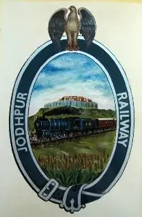
    Among the many princely state railways that flourished during British India, the Jodhpur State Railway (JSR) possessed one of the most distinctive and artistically designed emblems. Unlike many railway companies that relied on simple initials or monograms, the Jodhpur State Railway adopted an emblem that narrated a story through symbolism. Every element of the design reflected the pride of the Kingdom of Marwar, its royal patronage and its embrace of modern railway technology.

    The emblem was far more than a decorative badge. It represented the identity of the railway, its association with the ruling Rathore dynasty and its role in transforming the economy and society of western Rajasthan. Even today, it remains one of the finest examples of railway heraldry created by any princely state in India.

    The Birth of the Jodhpur State Railway

    The Jodhpur State Railway was established in 1885 during the reign of Maharaja Jaswant Singh II with the objective of connecting the desert kingdom of Marwar to the rapidly expanding railway network of British India. Prior to the arrival of the railway, trade across the region depended largely upon camel caravans and bullock carts, making transportation slow, costly and uncertain.

    The construction of the railway marked the beginning of a new era of transportation. It connected important commercial centres, facilitated the movement of salt, wool, livestock and agricultural produce, and transformed Jodhpur into an important railway centres of north-western India. As the railway expanded into one of the largest princely state railway systems, it naturally required a distinctive identity that reflected both its royal ownership and its growing importance. The emblem fulfilled this purpose perfectly.

    The Emblem

    The emblem of the Jodhpur State Railway is an artistic composition in which every element has been carefully chosen to communicate the character and aspirations of the railway.

    AI Generated Image of Emblem of Jodhpur State Railway

    The Royal Vulture – Guardian of the Railway

    Crowning the emblem is a majestic vulture with fully spread wings.

    The bird closely resembles the heraldic bird associated with the Royal House of Jodhpur (Marwar). In Rajput tradition, birds of prey symbolise vigilance, courage, protection and sovereign authority. Positioned above the entire composition, the vulture signifies that the railway functioned under the patronage and protection of the Maharaja.

    Its elevated position conveys authority and confidence, reminding the viewer that the railway was not merely a commercial enterprise but a prestigious institution belonging to the princely state.

    The Oval Frame – A Distinct Railway Identity

    The central painting is enclosed within a bold dark blue oval carrying the inscription “JODHPUR RAILWAY.”

    The oval frame serves as the official identity of the railway. Its unbroken circular form symbolises continuity and the railway network that united the scattered towns and settlements of Marwar. The prominent lettering leaves no doubt about the ownership of the railway and establishes a distinct institutional identity.

    Unlike elaborate European heraldic shields, the oval design is simple, elegant and immediately recognisable.

    The Steam Locomotive – The Symbol of Progress

    At the heart of the emblem is a beautifully illustrated steam locomotive pulling a passenger train across the countryside. The locomotive represents the arrival of industrial technology in the desert kingdom. It symbolises progress, engineering excellence and the determination of the rulers of Jodhpur to modernise their state.

    The artist deliberately depicts the locomotive moving confidently through the landscape, portraying the railway as an engine of development that brought commerce, communication and prosperity to regions that had previously depended upon traditional means of transport.

    Mehrangarh Fort – The Eternal Symbol of Marwar

    Dominating the background is the magnificent Mehrangarh Fort, one of India’s greatest hill forts and the historic seat of the Rathore rulers. Its inclusion immediately establishes the identity of the railway. Mehrangarh is inseparable from Jodhpur itself and serves as the ultimate symbol of the kingdom’s history, strength and royal authority.

    The juxtaposition of the steam locomotive with the ancient fort conveys a powerful message. The railway represents modernity, while Mehrangarh represents tradition. Together they demonstrate that the Kingdom of Jodhpur embraced technological progress without losing sight of its glorious heritage.

    Few railway emblems in India capture this balance between history and modernisation as effectively.

    The Landscape – Conquering the Desert

    The foreground portrays the natural landscape through which the train passes. This scene likely symbolises the difficult terrain of Marwar and the remarkable engineering achievement of constructing railway lines across the arid plains of western Rajasthan. The railway brought mobility, trade and opportunity to a region where transport had traditionally depended upon camel caravans. The landscape therefore represents not merely geography but the transformation of the desert through the power of rail transport.

    More Than a Railway Logo

    The Jodhpur State Railway emblem is remarkable because it tells a complete story rather than simply identifying the organisation.

    The vulture represents royal authority and protection.

    The steam locomotive represents technological progress and economic development.

    The Mehrangarh Fort represents the heritage, pride and identity of the Kingdom of Marwar.

    The desert landscape represents the region whose destiny was transformed by the railway.

    Together these elements communicate the message that the railway was an institution rooted in royal tradition while looking confidently towards the future.

    Unlike many railway emblems of the nineteenth century that consisted merely of initials or coats of arms, the Jodhpur State Railway adopted an artistic narrative that immediately conveyed its identity to passengers, employees and visitors alike.

    Historical Significance

    The Jodhpur State Railway became one of the most successful princely state railways in India. Its extensive metre-gauge network played a vital role in transporting salt, wool, livestock, sandstone and agricultural produce while also serving important strategic functions along India’s north-western frontier.

    The emblem reflected these achievements by presenting the railway as a symbol of progress under royal leadership. It became an enduring representation of the partnership between the Rathore rulers and the railway that helped modernise their kingdom.

    Legacy

    Following the integration of the princely states after Independence, the Jodhpur State Railway became part of the Western Railway of Indian Railways. Although its independent administrative identity came to an end, its emblem continues to survive as a beautiful examples of railway heraldry in India.

    Today, the emblem remains a visual reminder of a railway that successfully combined royal patronage, regional identity and technological progress into a single design. More than a century after it was first created, it continues to tell the story of a desert kingdom that embraced the railway as a symbol of modernity while proudly preserving its rich heritage.

  • Eastern Punjab Railway Emblem (1947–1952): A Symbol of Resilience in Independent India

    Eastern Punjab Railway Emblem (1947–1952): A Symbol of Resilience in Independent India

    The Eastern Punjab Railway (EPR) occupies a unique place in the history of Indian Railways. Born in the immediate aftermath of the Partition of India in 1947, it was one of the earliest railway systems created by independent India to restore rail transport in the territories that remained within the new Indian Union. Its emblem, though relatively simple in artistic execution, reflected the optimism, resilience and rebuilding spirit of a nation emerging from one of the most traumatic periods in its history.

    Unlike many of the princely state railways whose emblems celebrated royal dynasties, coats of arms and heraldic traditions, the Eastern Punjab Railway adopted an identity centred on progress, renewal and modern transportation. It represented a railway looking towards the future rather than commemorating a royal past.

    Historical Background

    The Partition of India in August 1947 divided the extensive North Western Railway, one of the largest railway systems in Asia. Much of its network, workshops and headquarters went to Pakistan, leaving India with fragmented railway lines across East Punjab.

    To restore railway administration in these areas, the Government of India established the Eastern Punjab Railway. The system inherited important sections connecting Delhi, Ambala, Jalandhar, Ludhiana, Pathankot, Firozpur and Amritsar. At the time, this railway played a critical role in:

    • Re-establishing passenger services disrupted by Partition.
    • Transporting millions of refugees.
    • Moving food grains, military supplies and essential commodities.
    • Rebuilding railway infrastructure damaged during communal violence.

    Although the Eastern Punjab Railway existed for only a few years (1947–1952), its contribution to stabilising northern India was immense.

    The Emblem

    Unlike elaborate Victorian heraldry, the Eastern Punjab Railway emblem employs a clean and purposeful composition.

    Eastern Punjab Railway Logo
    AI Generated Emblem of Eastern Punjab Railway

    The Rising Sun

    Dominating the upper portion of the shield is a rising sun whose rays spread across the background.

    This is perhaps the most significant element of the design.

    The rising sun symbolises:

    • The dawn of independent India.
    • Hope after the devastation of Partition.
    • Renewal and reconstruction.
    • The beginning of a new railway administration.

    Unlike the sunset motifs commonly found in imperial insignia, this represents a new beginning.

    The Steam Locomotive

    The lower half of the emblem features a classic broad-gauge steam locomotive. Rather than portraying a specific locomotive class, it represents the railway itself—strength, engineering and dependable public service.

    The locomotive stands for:

    • Industrial development.
    • Technological progress.
    • National integration.
    • The rebuilding of communication across northern India.

    Its prominent placement reinforces the idea that the railway was the principal instrument through which the nation was reconnecting its people.

    The Shield

    The locomotive and sun are enclosed within a stylised shield. Unlike medieval European heraldry, this shield serves primarily as a framing device, symbolising protection, stability and institutional identity. It provides a dignified backdrop without overwhelming the central imagery.

    Circular Inscription

    Encircling the shield is the inscription:

    EASTERN PUNJAB RAILWAY

    The circular arrangement creates a formal seal-like appearance commonly used by government departments during the late 1940s and early 1950s. Unlike many company railways that displayed abbreviations or monograms, the complete name projects clarity and official authority.

    Design Philosophy

    The Eastern Punjab Railway emblem marks a transition in Indian railway visual identity.

    Earlier railway insignia often featured:

    • Royal crowns
    • State coats of arms
    • Heraldic animals
    • Mythological figures
    • Imperial symbols

    In contrast, the Eastern Punjab Railway focused on only two universal motifs:

    • The sun, representing hope and renewal.
    • The steam locomotive, representing progress and connectivity.

    This simplicity reflects the priorities of newly independent India—nation-building rather than royal patronage. This also portrays the philosophy of Independent India which was Equality and Fraternity.

    Legacy

    The Eastern Punjab Railway ceased to exist in 1952 when the Government of India reorganised the railway system into six zonal railways. Its network became the nucleus of the newly created Northern Railway, which remains one of India’s largest railway zones today.

    Although the railway itself existed for only a brief period, its emblem represents a defining chapter in Indian railway history. It commemorates a railway that restored communication, supported refugee rehabilitation, and helped rebuild a divided nation during one of the most challenging periods in modern history.

    The emblem of the Eastern Punjab Railway is not merely a railway logo—it is a visual expression of India’s recovery after Partition. Through the imagery of a rising sun and a steadfast steam locomotive, it captures the ideals of hope, resilience, reconstruction and national unity.

    Among India’s heritage railway emblems, it stands apart for its restrained design and powerful symbolism. Rather than celebrating monarchy or empire, it celebrates the birth of a modern railway serving a newly independent nation—making it one of the most historically meaningful emblems in the Railway Board’s Heritage Logo Series.

  • Jaipur State Railway Emblem – When the Railway Became the Identity

    Jaipur State Railway Emblem – When the Railway Became the Identity

    Among the many railway emblems adopted by the princely states of India, the Jaipur State Railway emblem stands apart for what it deliberately chooses not to depict. Unlike the elaborate heraldic devices of states such as Jodhpur, Morvi or Jamnagar & Dwarka—which prominently showcased royal crowns, coats of arms, mythical animals or dynastic symbols—the Jaipur State Railway emblem is remarkably restrained. At its heart is not a king, a crest or a palace, but a steam locomotive.

    This design philosophy reflects the character of the Jaipur State Railway itself. Established by the Jaipur Durbar, the railway was conceived primarily as an instrument of administration, commerce and public utility rather than as a vehicle for projecting royal grandeur. Beginning with the Jaipur–Sawai Madhopur line in 1905 and later extending into the Shekhawati region, the network connected the capital with important commercial centres and the Bombay, Baroda & Central India Railway (BB&CI), significantly improving the state’s economic integration.

    A Locomotive at the Centre

    The most striking feature of the emblem is the steam locomotive placed prominently in the centre. Unlike many contemporary railway insignia where locomotives appeared only as decorative motifs, here the engine becomes the principal symbol. It immediately communicates the purpose of the organisation without requiring elaborate heraldic interpretation.

    The locomotive represents far more than a machine. At the beginning of the twentieth century, it embodied:

    • industrial progress,
    • engineering excellence,
    • economic development,
    • and the promise of modern transportation.

    For Jaipur State, the railway itself had become the most visible symbol of progress, and the emblem celebrates that achievement.

    Jaipur State Railway Logo
    Emblem of Jaipur State Railway

    Simplicity with Purpose

    A careful examination of the emblem reveals that it contains very little overt princely symbolism. There are no elaborate royal supporters, no complex shield carrying the full arms of the Kachwaha rulers, and no attempt to reproduce the grandeur of Jaipur’s royal court.

    Instead, the design is clean, balanced and functional. The decorative elements surrounding the locomotive serve primarily as framing devices rather than royal insignia. This simplicity gives the emblem an almost corporate appearance—quite advanced for its period—and suggests that the Jaipur administration wanted the railway to be recognised first as a professional transport organisation rather than merely an extension of the royal household.

    This restrained approach distinguishes Jaipur State Railway from many other princely railways, whose logos often mirrored their state’s coat of arms.

    Reflecting a Modern Administration

    The choice of such a practical emblem mirrors Jaipur State’s broader administrative outlook during the early twentieth century. The Jaipur Durbar invested heavily in infrastructure and recognised that railways were essential for trade, movement of goods, and efficient governance.

    By placing the locomotive at the centre, the emblem conveys a simple yet powerful message: The railway itself was the state’s greatest symbol of modernity. Rather than celebrating dynastic authority, the logo celebrates engineering achievement and public service.

    An Emblem of Function Rather than Power

    The Jaipur State Railway emblem therefore represents a subtle shift in visual identity. It marks a transition from traditional royal heraldry towards institutional branding. The locomotive is not merely decorative—it is the emblem’s identity. Every element of the design directs the viewer’s attention towards the engine, reinforcing the idea that the railway was the state’s pride and its gateway to economic growth. The absence of excessive royal symbolism makes the logo timeless, allowing it to represent not just the Jaipur Durbar but the railway organisation itself.

    Legacy

    Following Independence, the Jaipur State Railway became part of the integrated Indian Railways system. Although the organisation disappeared as an independent entity, its emblem survives as one of the officially recognised Indian Railways Heritage Logos, preserving the visual identity of a railway that chose progress over pomp.

    Today, the Jaipur State Railway emblem remains an excellent example of how a logo can communicate institutional values through simplicity. In an era when many princely railways relied on crowns, shields and heraldic animals to proclaim authority, Jaipur placed a steam locomotive at its centre—declaring that the railway itself was the state’s greatest achievement.

  • The Emblem of the Junagadh State Railway – A Symbol of Power, Prosperity and Maritime Heritage

    The Emblem of the Junagadh State Railway – A Symbol of Power, Prosperity and Maritime Heritage

    Among the many princely state railway emblems of pre-Independence India, the emblem of the Junagadh State Railway is perhaps one of the most distinctive. Unlike many railway insignia that prominently feature locomotives or heraldic crests, the Junagadh emblem tells the story of the state itself. Every element—the lion, the fort, the mountains, the sea and the tiny sailing boats—was carefully chosen to represent the geographical, political and economic identity of the princely state. Rather than glorifying the railway alone, the emblem presents the railway as a lifeline connecting the state’s natural wealth, maritime trade and royal authority.

    The Origins of the Junagadh State Railway

    The Junagadh State Railway was established by the Nawabs of Junagadh during the late nineteenth century as part of the rapid expansion of railways across Kathiawar (Saurashtra). The first sections opened in the 1880s and gradually linked Junagadh with Veraval, Jetalsar and neighbouring princely states. These connections integrated the state into the wider railway network of western India, facilitating passenger movement, trade and pilgrimage while strengthening Junagadh’s economy.

    Unlike the larger railway companies operated directly by the British Government, the Junagadh State Railway remained a symbol of the Nawab’s administration and reflected the state’s independent identity within British India.

    The Emblem

    Junagadh State Railway Emblem
    Emblem of Junagarh State Railway

    At first glance, the emblem appears simple, but every component carries symbolic significance.

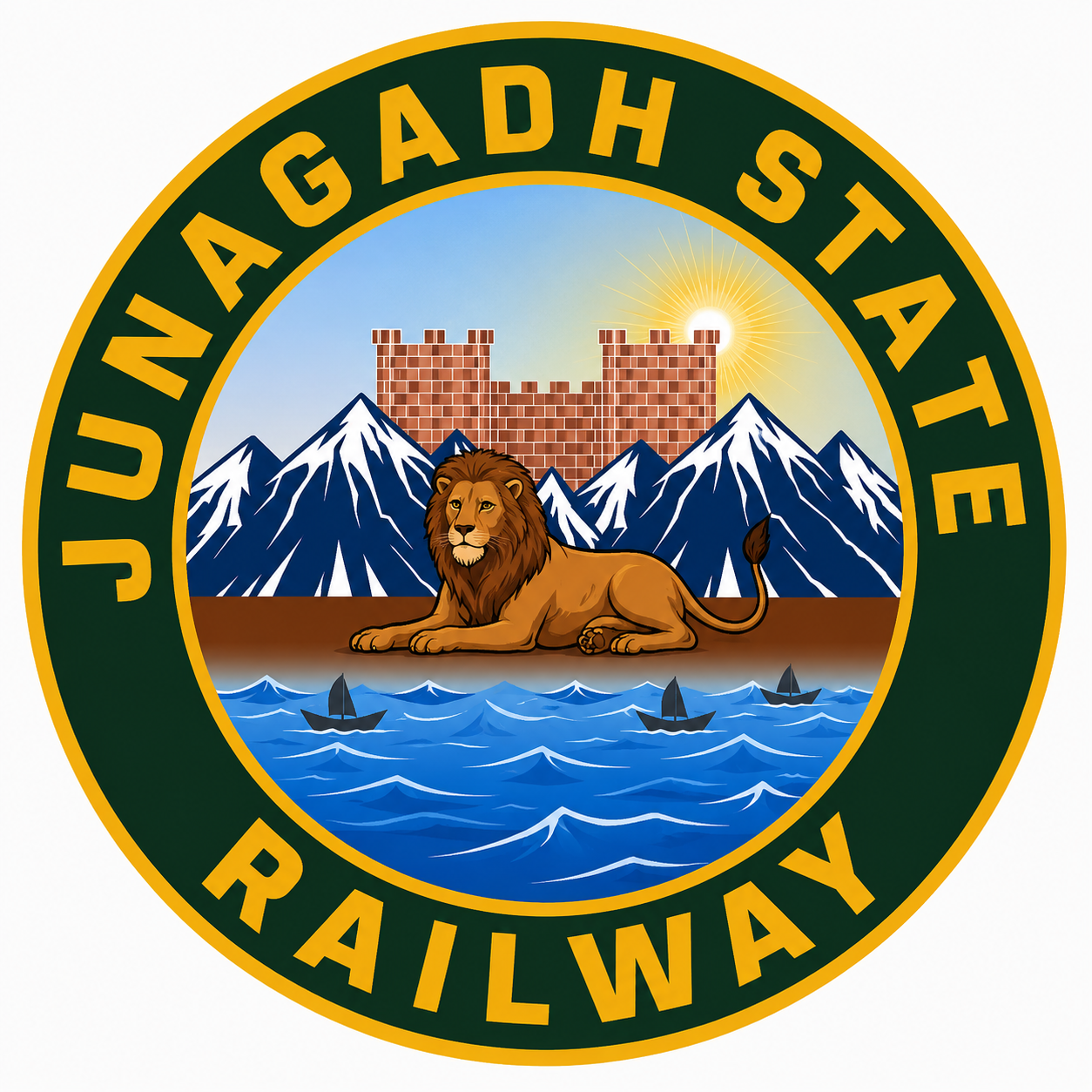
    The outer circular band, finished in deep green with golden lettering proclaiming “JUNAGADH STATE RAILWAY,” represents continuity, unity and permanence. The circular form was a popular design among princely state railway logos because it conveyed authority while providing an instantly recognisable corporate identity.

    At the centre of the emblem lies a majestic lion resting calmly upon a strip of land. This is undoubtedly the most important feature of the logo. Junagadh was—and continues to be—the home of the Asiatic Lion, whose last natural habitat survives in the Gir forests. The lion symbolises courage, sovereignty and the unique natural heritage of the state. Rather than depicting the animal in an aggressive posture, the artist portrays it in repose, conveying confidence and regal authority rather than conquest.

    Behind the lion rises a fortified structure, representing the historic Uparkot Fort, one of India’s oldest surviving fortifications and a defining landmark of Junagadh. The fort signifies the antiquity, resilience and military strength of the princely state.

    Flanking the fort are towering snow-clad mountains. Although Junagadh itself does not possess Himalayan peaks, these stylised mountains are likely intended to represent the rugged Girnar Hills, one of western India’s most sacred mountain ranges. The artist appears to have used dramatic alpine forms to emphasise grandeur and permanence rather than geographical accuracy.

    A radiant sun rising behind the fort symbolises hope, prosperity and enlightenment. Across Indian heraldic traditions, the rising sun represents progress and the dawn of a new era—an appropriate message for a railway that was transforming transportation and commerce.

    The Sea and Three Boats

    Perhaps the most intriguing aspect of the emblem is the depiction of the blue sea in the foreground, upon which three small sailing boats can be seen.

    These boats are not decorative additions. They are a direct reference to Junagadh’s long maritime tradition. The state controlled important ports such as Veraval, one of western India’s oldest fishing and trading harbours. For centuries, merchants from this coast traded with Arabia, East Africa and the Persian Gulf.

    The inclusion of three boats symbolises maritime commerce, prosperity and Junagadh’s historic connection with the Arabian Sea. Their presence also reminds the viewer that the railway was not an isolated transport system—it was designed to connect inland markets with coastal ports, enabling goods and passengers to move efficiently between sea and rail.

    In this sense, the boats complete the story told by the emblem: the railway united forests, hills, forts and ports into a single economic network.

    Why the Emblem is Unique

    Most princely railway emblems either displayed royal coats of arms or locomotives. The Junagadh State Railway emblem is unusual because it contains neither. Instead, it presents a visual narrative of the state itself.

    The lion represents wildlife and sovereignty.

    The fort represents history and political authority.

    The Girnar hills symbolise geography and spirituality.

    The sea and boats celebrate maritime trade.

    Together these elements communicate the identity of Junagadh more effectively than any locomotive could.

    A Lasting Legacy

    Following Independence, the Junagadh State Railway was merged into the railway systems of Saurashtra and eventually became part of Western Railway under Indian Railways. While the railway itself disappeared as an independent entity, its emblem remains an important reminder of how princely states expressed their identity through railway symbolism.

    Today, the Junagadh State Railway emblem stands as more than a railway logo. It is a miniature portrait of an entire kingdom—celebrating its wildlife, historic fortifications, sacred landscape and maritime traditions. It reflects an era when railways were not merely transport networks but proud ambassadors of the states they served, carrying their heritage as prominently as their passengers and freight.

  • The Emblem of the Jamnagar & Dwarka Railway: A Railway Built in the Service of Faith

    The Emblem of the Jamnagar & Dwarka Railway: A Railway Built in the Service of Faith

    Among the many railway emblems used by the princely states of India, the insignia of the Jamnagar & Dwarka Railway occupies a unique place. Unlike many state railways that adopted royal coats of arms featuring lions, shields and crowns, this railway chose to depict the sacred landscape of Dwarka, one of Hinduism’s holiest pilgrimage centres. In doing so, the emblem conveys a powerful message—that the railway was not merely a transport system but a bridge connecting millions of devotees with one of India’s most revered places of worship.

    The emblem beautifully reflects the close relationship between the railway, the princely State of Nawanagar (Jamnagar) and the spiritual heritage of Dwarka.

    Origin of the Jamnagar & Dwarka Railway

    The Jamnagar & Dwarka Railway formed part of the railway network developed by the rulers of the princely State of Nawanagar during the late nineteenth and early twentieth centuries. Like several progressive princely states, Nawanagar recognised the importance of rail transport in improving communication, encouraging trade and integrating its towns with ports and neighbouring railway systems.

    However, the railway had another equally significant objective—to provide easier access to Dwarka, one of the four sacred Char Dham pilgrimage sites of Hinduism and the legendary kingdom of Lord Krishna.

    Before the arrival of the railway, pilgrims travelled for days through difficult terrain using bullock carts, horse-drawn vehicles or coastal boats. The construction of the railway transformed pilgrimage by making the sacred city accessible to devotees from across western and northern India.

    Thus, the railway became an important instrument for both economic development and religious tourism long before the term itself came into existence.

    The Emblem

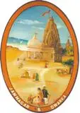
    The emblem is designed as an elegant oval painting enclosed within a decorative border. Unlike heraldic emblems that rely upon symbolic devices, the Jamnagar & Dwarka Railway chose to narrate its story through an artistic landscape.

    Jamnagar and Dwarka State Railway Emblem
    The Emblem of Jamnagar &Dwarka Railway

    The Dwarkadhish Temple

    Dominating the composition is the magnificent Dwarkadhish Temple (Jagat Mandir), whose towering shikhara rises prominently against the sky. The temple is the spiritual heart of Dwarka and one of the most recognisable landmarks in western India. By placing it at the centre of the emblem, the railway proclaimed that its identity was inseparable from this sacred destination. Rather than representing political authority, the emblem celebrates spiritual heritage.

    The Temple Flag

    At the summit of the temple flies the famous triangular flag of the Dwarkadhish Temple. This sacred flag has been changed several times each day for centuries, symbolising the uninterrupted continuity of worship. Within the emblem, it represents faith, devotion and the timeless religious traditions associated with Lord Krishna.

    The Temple Complex

    Adjacent to the main shrine is another domed structure forming part of the temple precinct. Its inclusion reminds the viewer that Dwarka is not simply a single monument but a living pilgrimage town centred around an active temple complex that has attracted devotees for generations.

    Pilgrims

    Small human figures can be seen approaching and moving around the temple. These pilgrims are perhaps the most significant element of the entire composition. Their presence illustrates the very purpose of the railway—to carry thousands of devotees safely and comfortably to one of India’s holiest cities.

    The railway is represented not by locomotives or tracks but by the people whose journeys it made possible.

    The Sacred Landscape

    The sandy foreground and open surroundings faithfully depict the coastal setting of Dwarka. The artist intentionally avoids industrial imagery. There are no locomotives, railway bridges or engineering works. Instead, the emphasis remains firmly on the destination rather than the means of reaching it. This artistic choice distinguishes the emblem from almost every other princely state railway insignia.

    The Symbolism Behind the Emblem

    The Jamnagar & Dwarka Railway understood that its greatest achievement was not merely laying railway tracks but making one of India’s foremost pilgrimage centres accessible to ordinary people. The emblem therefore transforms the holy city itself into the symbol of the railway. For pilgrims, it represented hope, faith and easier access to the abode of Lord Krishna.

    For the rulers of Nawanagar, it demonstrated their commitment to preserving and promoting one of India’s greatest centres of religious importance while simultaneously modernising the state’s transport infrastructure.

    For traders and merchants, the railway improved connectivity between ports, towns and inland markets, thereby contributing to the economic prosperity of the region.

    Thus, the emblem successfully combines spirituality, public service and economic progress within a single artistic composition.

    Artistic Significance

    Unlike the heraldic emblems of states such as Jodhpur, Morvi or Gondal, the Jamnagar & Dwarka Railway emblem resembles a traditional Indian miniature painting. Its warm colours, carefully balanced architecture and animated human figures create a narrative rather than a conventional coat of arms. Instead of celebrating royal authority, it celebrates a sacred journey.

    This makes it one of the most distinctive railway emblems produced by any princely state in India.

    Legacy

    Although the Jamnagar & Dwarka Railway eventually became part of the wider Indian railway system after Independence, its emblem continues to preserve the memory of a railway that served both the practical and spiritual needs of society.

    Long before pilgrimage tourism became an organised industry, the railway enabled countless devotees to undertake journeys that had previously been long, expensive and physically demanding. The emblem remains a reminder that railways are more than engineering achievements—they are instruments that connect people with commerce, culture, history and faith.

    Among all the princely state railway emblems of India, the insignia of the Jamnagar & Dwarka Railway stands apart for replacing royal heraldry with sacred geography. It transformed the image of the Dwarkadhish Temple into the identity of the railway itself, symbolising a network whose greatest achievement was bringing millions of pilgrims closer to one of the holiest cities of the Hindu world.

  • The Emblem of the Gondal State Railway: A Symbol of Rajput Honour and Progressive Governance

    The Emblem of the Gondal State Railway: A Symbol of Rajput Honour and Progressive Governance

    Among the many princely state railways of British India, the Gondal State Railway occupies a distinctive place. Although modest in size, it was one of the best-administered princely railways and reflected the progressive vision of the rulers of the State of Gondal in present-day Gujarat. Its emblem, derived from the royal coat of arms of Gondal, is remarkable for its simplicity and dignity. Rather than depicting animals or elaborate heraldic devices, it centres on the timeless Rajput symbols of the sword, shield, and the state’s royal motto.

    The emblem was more than a decorative insignia. It represented the values upon which the Gondal State sought to build its administration—courage, honour, preparedness and truthful governance. Even today, it remains an important part of India’s railway heritage and offers a glimpse into the identity of one of Kathiawar’s most progressive princely states.

    The History of the Gondal State Railway

    The Gondal State Railway was established during the late nineteenth century under the enlightened rule of the Gondal Darbar. Situated in the Kathiawar Peninsula of present-day Gujarat, Gondal recognised the importance of railways in promoting trade, agriculture and public welfare.

    Working in cooperation with neighbouring princely states and the British Government, the railway developed an efficient network that connected Gondal with Rajkot, Jetalsar, Porbandar and other important commercial centres. It became part of the wider Kathiawar railway system, facilitating the movement of cotton, groundnuts, salt, livestock and passengers across the region.

    Unlike many princely railways that struggled financially, the Gondal State Railway earned a reputation for efficient management and sound administration, reflecting the progressive policies of its rulers.

    The Origin of the Emblem

    The Gondal State Railway adopted an emblem derived from the royal coat of arms of the State of Gondal. Since the railway was owned and administered by the Gondal Darbar, it naturally carried the state’s official insignia on its documents, publicity material and ceremonial publications.

    Rather than creating an entirely new corporate logo, the railway projected the authority and prestige of the ruling house through its existing heraldic identity.

    The Design of the Emblem

    The Gondal State Railway emblem is characterised by its restrained and elegant composition.

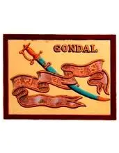
    Its principal elements include:

    • A ceremonial sword.
    • A shield, representing protection and responsibility.
    • A royal crest above the central device.
    • A scroll bearing the state’s Sanskrit motto.

    Unlike many railway companies of the period that adopted winged wheels, locomotives or industrial motifs, the Gondal State Railway retained a design firmly rooted in Rajput heraldic tradition.

    Gondal State Railway Emblem
    Gondal State Railway Emblem

    The Sword: Symbol of Courage and Honour

    The sword is the dominant feature of the emblem.

    For the Jadeja Rajputs, who ruled Gondal, the sword symbolised:

    • courage,
    • military honour,
    • justice,
    • readiness to defend the kingdom,
    • and sovereign authority.

    In Rajput culture, the sword represented not merely a weapon but a sacred duty to protect the state and uphold righteousness. Its inclusion in the railway emblem reflected the close relationship between the railway and the ruling house.

    The Shield: Protection and Responsible Governance

    Accompanying the sword is the shield, another enduring symbol in heraldry.

    The shield represents:

    • protection of the people,
    • stability,
    • disciplined administration,
    • responsibility,
    • and the defence of the kingdom.

    Together, the sword and shield convey the ideal balance between strength and restraint—qualities expected of a just ruler.

    The Royal Crest

    Above the central device appears the royal crest, signifying the sovereignty of the Gondal State.

    Although relatively simple in design, the crest reinforces that the railway was not merely a transport undertaking but an institution operating under the direct authority of the Gondal Darbar.

    The State Motto

    One of the most distinctive features of the emblem is the Sanskrit motto:

    “Sajyam Cha Satyam”

    The phrase is commonly translated as:

    “Ready and True”

    or

    “Prepared and Faithful.”

    The motto expresses ideals that extended beyond military preparedness. It reflects the values of honesty, loyalty, readiness to serve and integrity in public administration. These principles were consistent with the progressive governance for which Gondal State became well known during the reign of Maharaja Bhagvatsinhji.

    Symbolism of the Emblem

    Taken together, the elements of the Gondal State Railway emblem communicate a clear message.

    The sword represents courage and honour.

    The shield represents protection and responsible governance.

    The royal crest symbolises sovereign authority.

    The motto reinforces ideals of truthfulness, preparedness and faithful service. Unlike many railway emblems that celebrated industrial achievement through mechanical imagery, the Gondal State Railway emphasised the moral and administrative values upon which the state believed good governance should rest.

    The Emblem and the Identity of the Railway

    The Gondal State Railway was widely regarded as one of the best-managed princely railways in western India. Its emblem reflected this reputation.

    The insignia conveyed that the railway was:

    • an institution of the Gondal State,
    • governed with discipline,
    • committed to public service,
    • and guided by the principles of honour and integrity.

    The emblem thus became an important part of the railway’s identity, linking technological progress with the traditions of Rajput governance.

    Legacy

    Following the integration of princely states after Independence, the Gondal State Railway became part of the Indian Railways network. While the railway lost its separate administrative identity, its emblem survives as an important reminder of the contribution made by princely states to India’s railway development. Today, the Gondal State Railway emblem is preserved through Indian Railways’ Heritage Logo initiative, ensuring that this unique chapter of railway history is not forgotten.

    The emblem of the Gondal State Railway is a fine example of how a princely state expressed its identity through symbolism rather than ornamentation. The sword, shield, royal crest and inspiring motto together project ideals of courage, responsibility, preparedness and truthful governance. More than a railway insignia, it represents the values that guided one of western India’s most progressive princely states. In preserving and studying such emblems, we gain a deeper appreciation of the cultural heritage that accompanied the expansion of railways across the Indian subcontinent.

  • The Emblem of the Datia State Railway: A Symbol of Bundela Heritage on India’s Smallest Princely Railway

    The Emblem of the Datia State Railway: A Symbol of Bundela Heritage on India’s Smallest Princely Railway

    Among the many princely state railways that once operated across India, the Datia State Railway (DSR) occupies a unique place in railway history. Unlike the extensive railway systems of Mysore, Mewar or Jodhpur, Datia’s railway was remarkably small, serving primarily the needs of a compact Bundelkhand princely state. Yet, despite its limited geographical reach, it possessed its own identity, administration and official insignia that reflected the sovereignty and traditions of the State of Datia.

    The emblem of the Datia State Railway was not merely a decorative mark applied to locomotives and official correspondence. It represented the authority of the Maharaja, the pride of the Bundela dynasty, and the state’s determination to embrace modern transport while preserving its royal identity.

    The Origins of the Datia State Railway

    The princely State of Datia, situated in present-day Madhya Pradesh, was ruled by the Bundela Rajput dynasty, one of the oldest and most distinguished ruling houses of Bundelkhand. Although relatively small in territory, Datia occupied an important strategic position between Jhansi and Gwalior.

    To improve communication with the national railway network and stimulate trade, the Datia Darbar established the Datia State Railway during the early twentieth century. The railway connected the princely capital with the main line, facilitating the movement of passengers, agricultural produce and official traffic.

    Unlike larger state railways, the Datia State Railway was intended primarily as a feeder system. Nevertheless, it became an important symbol of modern governance under the Maharaja.

    The Origin of the Railway Emblem

    As was customary among princely states, the Datia State Railway adopted an emblem derived from the Royal Coat of Arms of the State of Datia. Rather than creating an entirely new identity, the railway administration used the symbols already associated with the Bundela rulers. This practice reinforced the idea that the railway was not an independent commercial enterprise but an official department of the princely government. Every locomotive, carriage, official document and station seal bearing the emblem proclaimed that the railway operated under the direct authority of the Maharaja of Datia.

    The Design of the Emblem

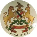
    Datia State Railway Emblem

    Although surviving examples are rare and artistic representations varied slightly over time, the emblem reflected the principal elements of the Datia royal arms. Every element of the emblem appears to have been chosen with care, although no surviving official document has been found that explicitly explains its symbolism. The following interpretation is based on the visual design of the coat of arms, the heraldic traditions of Indian princely states, and the historical context of Datia.

    The Bird Crest

    At the top of the emblem appears a bird, identified in available heraldic records as a Chukar Partridge (Alectoris chukar). While no official explanation of its inclusion has survived, the bird was likely intended to represent the natural heritage of the Bundelkhand region.

    The Chukar has long been associated with the rocky hills, scrub forests and open countryside of central India. It may also reflect the hunting traditions of the Bundela rulers, for whom falconry and game hunting formed an important part of royal culture. Symbolically, the bird can be understood as representing alertness, vigilance and the close relationship between the ruling house and the land over which it governed.

    The Lion

    One side of the shield is supported by a lion, one of the most enduring symbols of kingship in Indian heraldry.

    The lion represents:

    • Royal authority
    • Courage and military strength
    • Justice and leadership
    • Sovereignty and prestige

    For the Bundela rulers of Datia, the lion projected the image of a powerful and independent princely state capable of defending its honour and traditions.

    The Sambar Deer

    Opposite the lion stands a Sambar Deer, a comparatively rare heraldic supporter among Indian princely states.

    Its inclusion is particularly significant. Native to the forests of Bundelkhand, the sambar symbolises:

    • Harmony with nature
    • Grace and dignity
    • Prosperity and abundance
    • The rich wildlife and forests of the Datia region

    Unlike more aggressive heraldic animals, the sambar introduces an element of balance, suggesting that a prosperous kingdom is sustained not only by military strength but also by the preservation of its natural wealth.

    The Combined Symbolism

    Taken together, the three principal figures—the Chukar Partridge, the Lion and the Sambar Deer—create a remarkably balanced composition.

    The lion embodies the power and authority of the ruler.

    The sambar deer represents the land, its forests and the prosperity of the state.

    The bird above the shield symbolically watches over both, reinforcing the ideals of vigilance and guardianship.

    Rather than relying solely on symbols of military power, the Datia State emblem presents a broader vision of kingship—one in which courage, justice, prosperity and harmony with nature exist together. It is this distinctive symbolism that made the Datia State Railway emblem not merely a railway insignia, but an expression of the state’s royal identity and cultural heritage.

    Decorative Scrollwork

    The emblem was framed with ornamental scrolls typical of princely heraldry. These decorative elements reflected royal dignity and the artistic traditions of Bundelkhand.

    Why Did Datia Use the Royal Emblem?

    The adoption of the royal coat of arms served several important purposes.

    Assertion of State Ownership

    The railway belonged to the Datia Darbar rather than to the British Government or a private company. Displaying the royal insignia made this ownership immediately apparent.

    Strengthening Public Confidence

    For many residents of Bundelkhand, the railway represented modern technology. The familiar royal emblem reassured passengers that the service enjoyed the patronage and supervision of the Maharaja.

    Administrative Identity

    Although the railway was comparatively small, it required a distinct identity. The emblem distinguished Datia State Railway from neighbouring systems such as:

    • Great Indian Peninsula Railway,
    • Gwalior Light Railway,
    • Indian Midland Railway,
    • and the Jhansi section of larger railway companies.

    The End of the Datia State Railway

    Following Independence and the accession of Datia to the Indian Union in 1948, the Datia State Railway was integrated into Indian Railways. Its separate administration disappeared, and the royal insignia gradually gave way to the symbols of the national railway system. Today, only scattered archival references, official records and a handful of photographs preserve the memory of this unique princely railway.

    Legacy: More Than a Heraldic Device

    The emblem of the Datia State Railway represented more than royal symbolism. It reflected the determination of a relatively small princely state to participate in India’s railway revolution while preserving its own political and cultural identity. Although the railway itself has disappeared, the emblem continues to symbolise the administrative vision of the Datia rulers, the Bundela tradition of public service, and the important contribution made by even the smallest princely states to India’s railway heritage. Though modest in appearance and attached to one of India’s smallest railway systems, the Datia State Railway emblem remains an important part of India’s railway heritage. It reminds us that the story of Indian railways is not only about vast trunk routes and famous companies but also about the aspirations of small princely states that used railways—and the symbols upon them—to express their identity, independence and vision for the future.